Support – Chat, Phone, FAQ, Self-Service
The module I never get to talk about in interviews.
Support is rarely the headline feature in a portfolio. It doesn't look as impressive as a dashboard or a search flow. But it's the thing that stops students from abandoning their booking journey mid-way.
This module is genuinely well designed. Not because I was brilliant, but because the problem was clear and the solution was inevitable — and for once, the platform constraints actually helped.
The Problem
Students narrow down a property. Then hesitation sets in.
"What happens if I have a problem after booking?"
"How do I pay? What documents do I need?"
"Is this company trustworthy?"
These aren't property questions. They're anxiety questions. And if they go unanswered, students abandon the journey and look elsewhere.
The goal: Make help instantly accessible at any point in the journey — not buried in a "Contact Us" page nobody finds.
The Architecture Decision
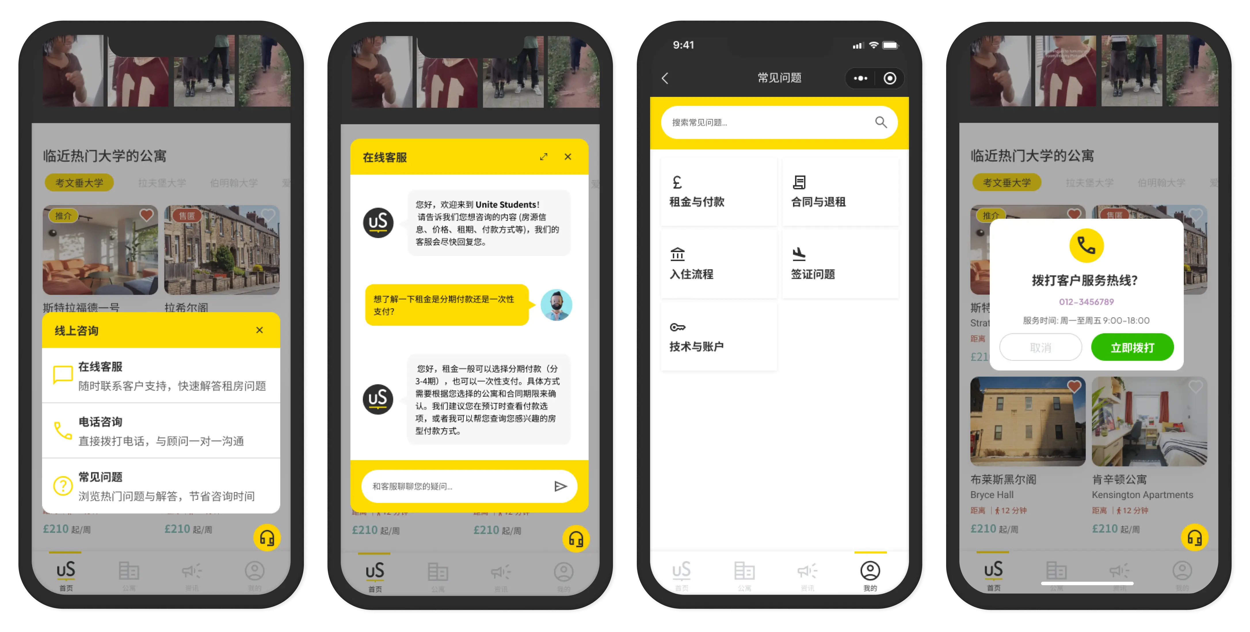
One persistent support button in the bottom navigation. Always visible. Opens an overlay with three options:
- Online Chat — WeChat-native messaging with a sales consultant
- Phone Support — Direct call with confirmation dialog
- FAQ — Quick self-service for common questions
Why this structure
Students needed choice. Some want instant answers (chat). Some trust voice more than text (phone). Some just need a quick fact (FAQ). One entry point, three channels, student chooses.
What Actually Worked
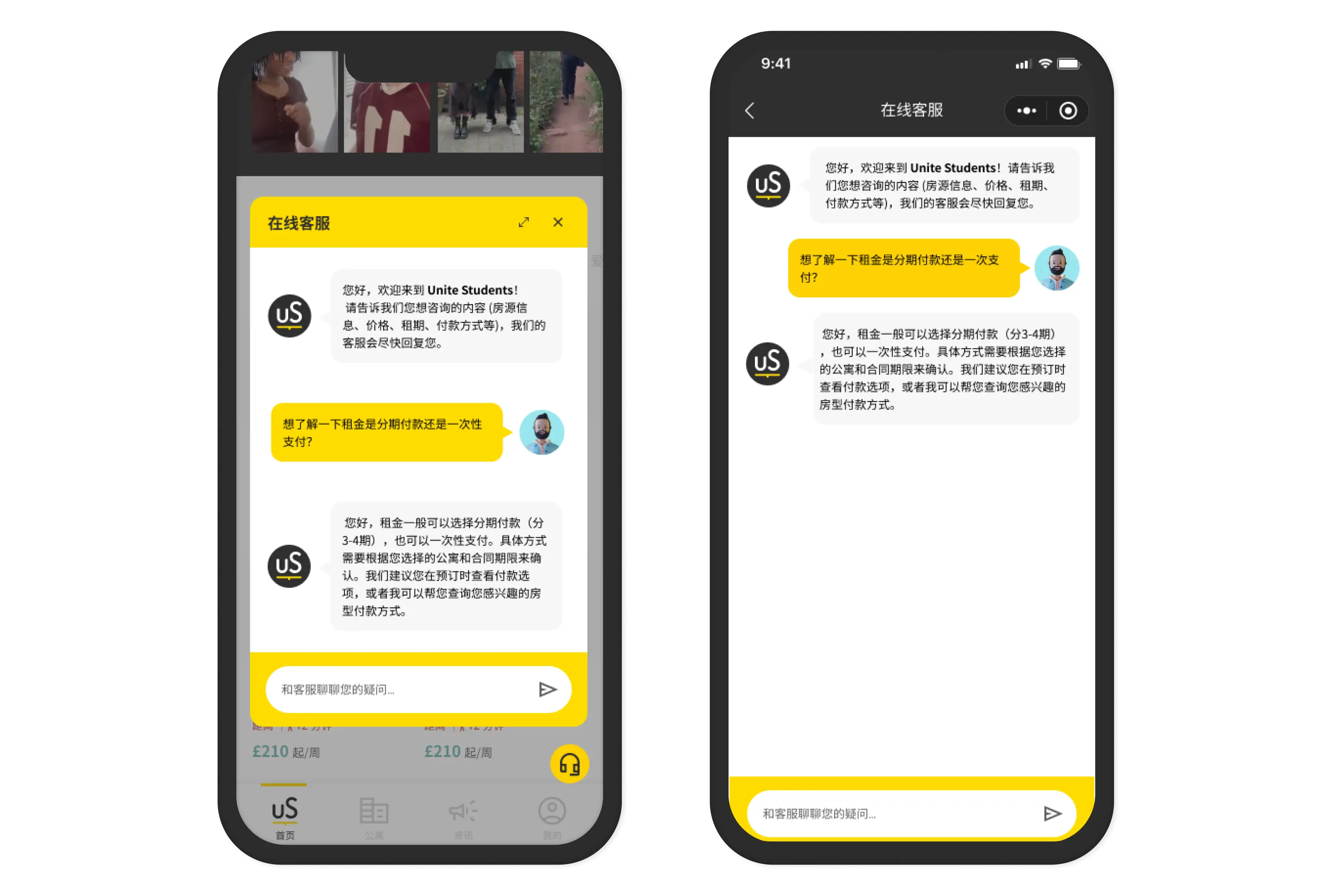
WeChat-Native Chat
This was the right decision — and it was obvious.
Students are already in WeChat. They message their families on WeChat. They use WeChat for everything. The moment we asked them to open a different chat app or wait for an email, we lost them.
WeChat-native chat kept them in their environment. No friction. No context switch. Just chat — the thing they do all day.
The conversation history persisted. Students could review what was said without asking the same question twice. Sales consultants could see full context. Both sides benefited.
Phone Support With Confirmation Dialog
Small detail. Big impact.
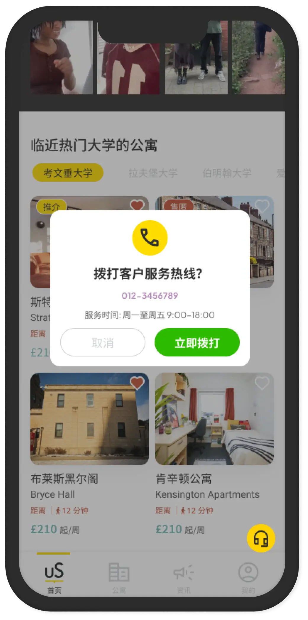
Before connecting a call, a dialog shows:
- The phone number
- Operating hours
- Connection details
Why this mattered: Chinese students calling a UK number from China — timezone differences, international call costs, operating hours. The confirmation dialog set expectations before they connected. Fewer abandoned calls. Fewer frustrated students who called outside hours.
This wasn't in the original brief. I added it because I thought about what could go wrong. That's the kind of detail that doesn't show up in feature lists but makes real operational difference.
FAQ — The Honest Part
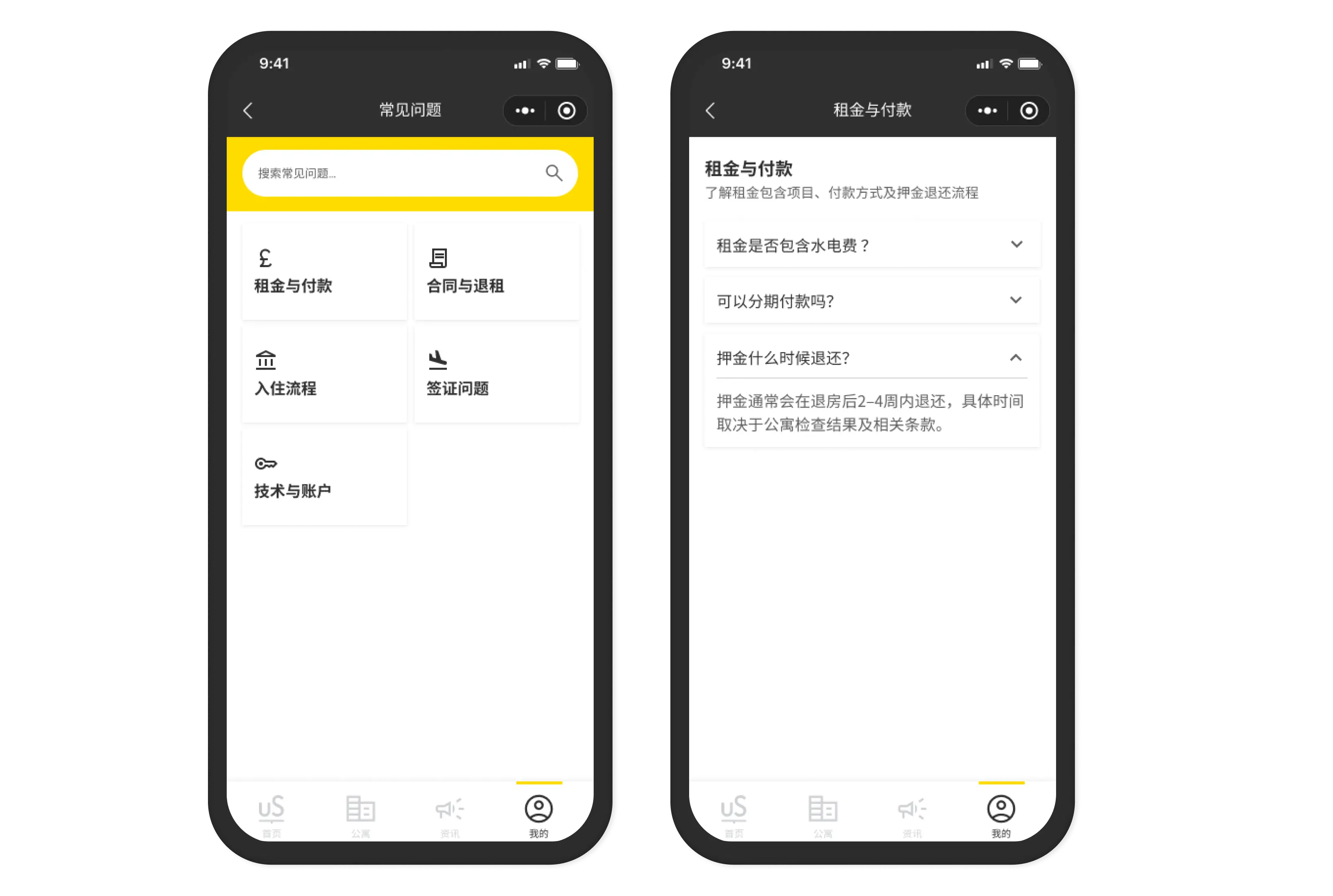
The FAQ structure was good. Two levels:
- Quick access
- Shortcut from the support overlay. Fast answers without leaving current screen.
- Full FAQ
- Accessible from the "My" profile section. Categorized topics, detailed content.
- What I assumed
- I could predict what students would ask.
- What I should've done
- Asked actual students — or the Unite Students support team — "What are the 20 questions you answer every week?" Then built the FAQ content around those.
Instead, the FAQ categories were based on what we thought students would ask. Some were right. Some weren't. I don't have data to prove which because post-launch FAQ analytics weren't tracked.
- Lesson
- Content strategy matters as much as information architecture. A well-structured FAQ with wrong content is still a bad FAQ.
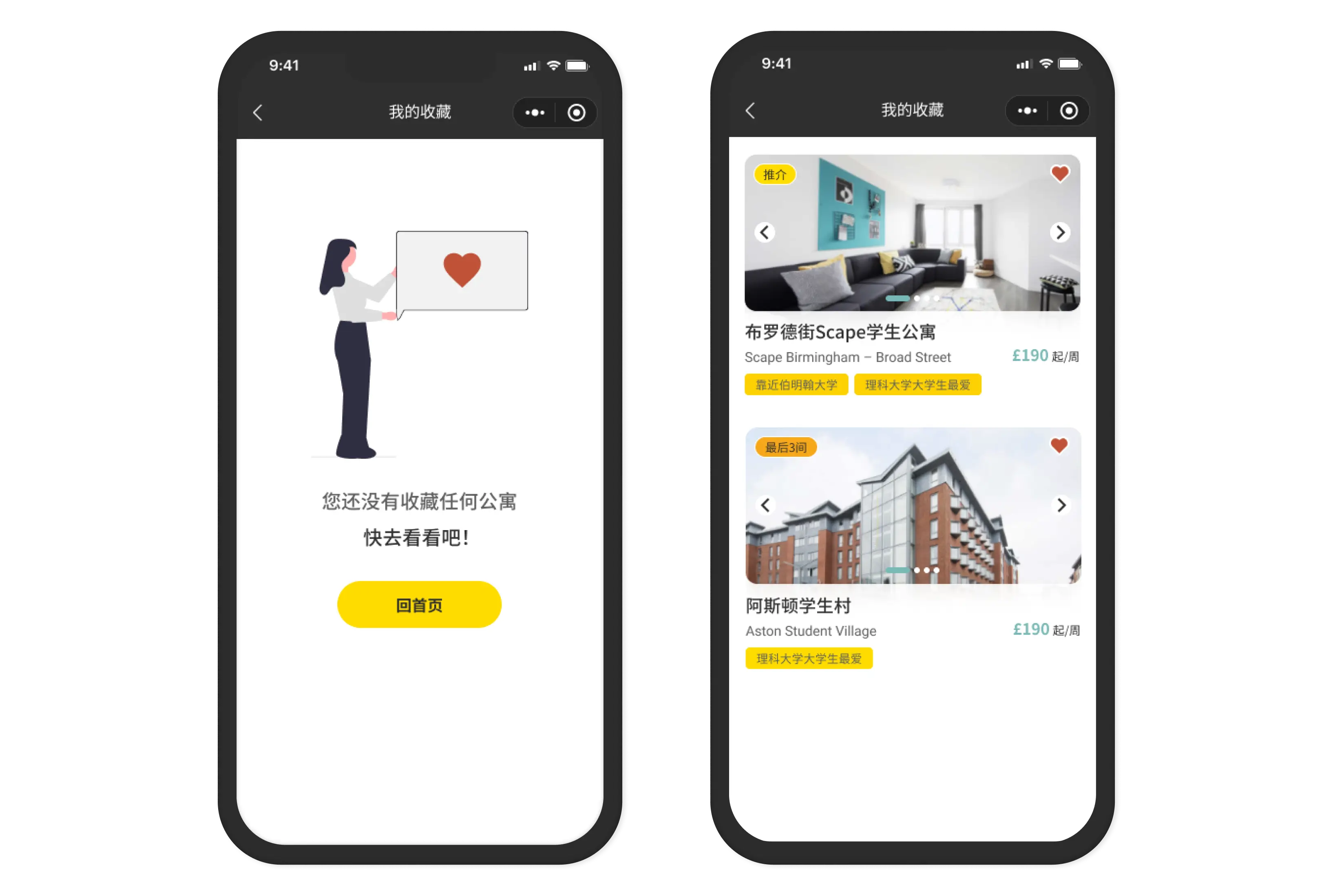
Favourites — The Underrated Feature
Students could save properties during browsing and return to them later.
This sounds obvious. But it matters for this specific audience.
Chinese international students don't make housing decisions alone. They consult parents, discuss with future classmates, compare notes over WeChat. The ability to save a shortlist and share it (or revisit it during a family video call) fit directly into how decisions actually got made.
- What I'd add if redesigning
- A "Share shortlist" function. One tap to send a saved list via WeChat to parents or friends. The behaviour was already there — students were screenshotting their favourites and sending them manually.
The Honest Take
Support is the module I'm most satisfied with — not because it's the most visible, but because every decision had a clear reason behind it.
- WeChat-native chat = students already live there.
- Confirmation dialog for calls = prevents friction for international callers.
- Persistent support button = help is always one tap away.
- FAQ quick access = removes the need to hunt.
The only gap: FAQ content. Structure was right. Content was assumed, not validated.
What this taught me
You can design the right architecture and still fill it with the wrong content. Information architecture and content strategy are different problems. I solved the first. I skipped the second.
Next time: get the real questions before designing the answers.